KSS International – Brand Identity & Logo Design

Overview

KSS International is a Kenya-based firm specializing in security and protection services. Their mission is to provide reliable, professional, and discreet solutions tailored to diverse client needs. The company sought a brand identity that would reflect its core values of trust, strength, and vigilance.

Objective

  • Develop a Distinctive Logo: Create a logo that embodies authority, security, and professionalism.

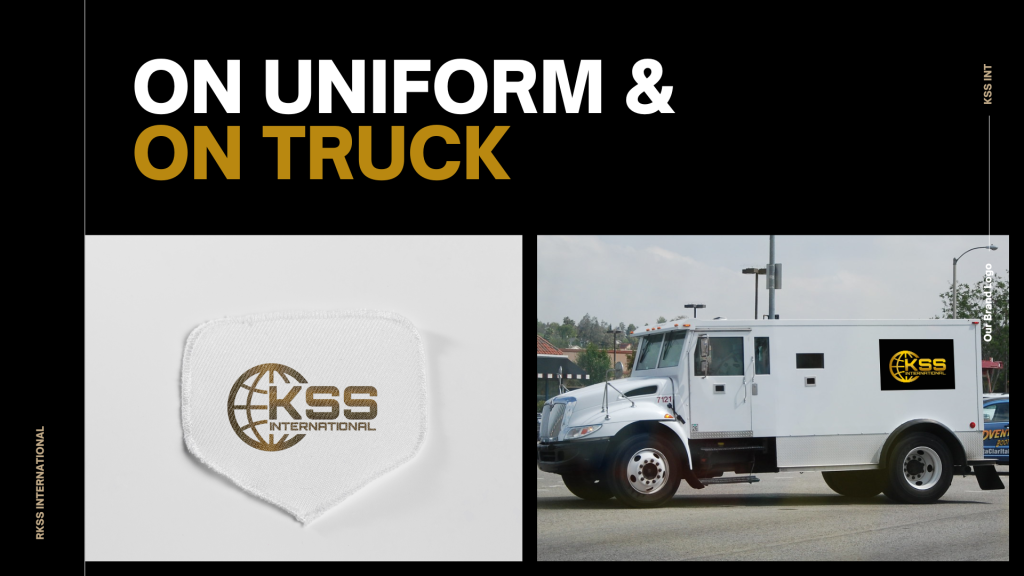
  • Establish a Cohesive Brand Identity: Design a visual system adaptable across various mediums, including uniforms, vehicles, and digital platforms.

  • Enhance Brand Recognition: Ensure the brand stands out in a competitive market through a unique and memorable identity.

  •  

Design Strategy

The design process focused on merging traditional security symbolism with modern aesthetics. Key considerations included:

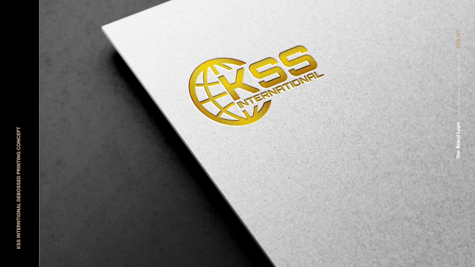
    • Primary Logo: A stylized shield integrating the initials “KSS,” representing security and unity.

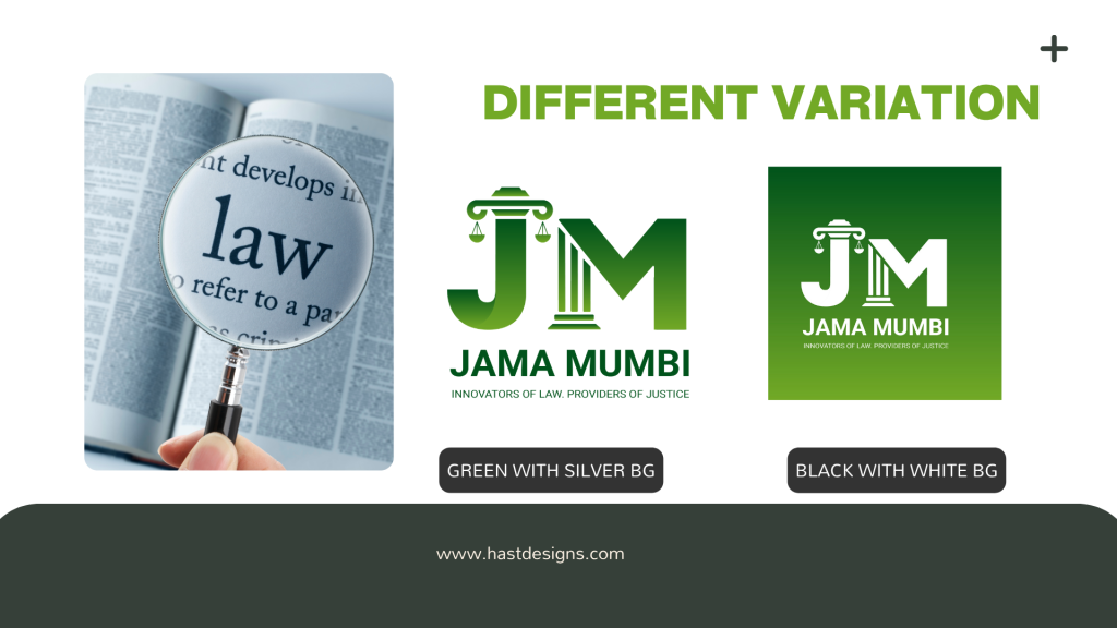
    • Secondary Marks: Simplified icons for use on smaller applications, maintaining brand consistency.

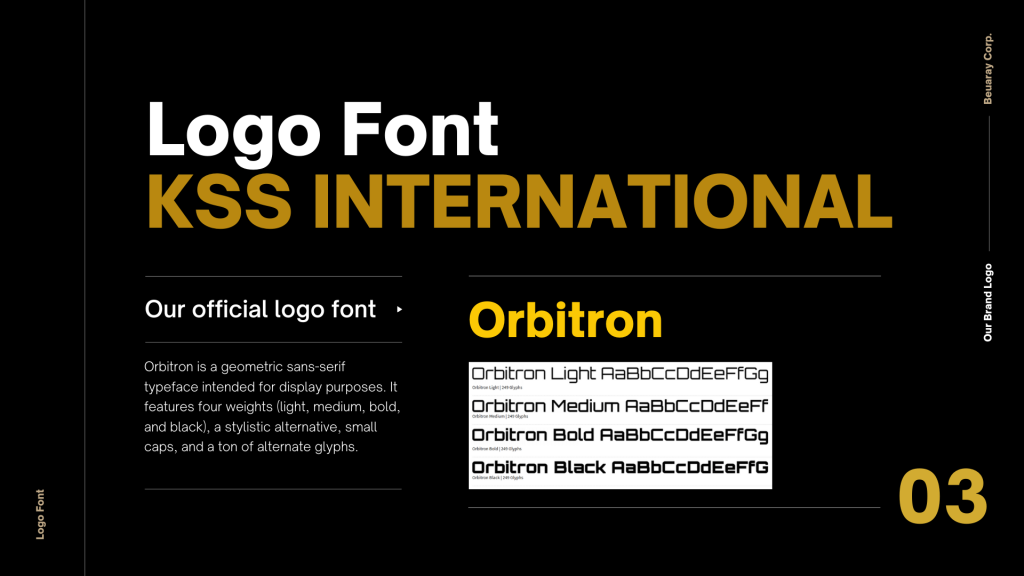
    • Typography System: A hierarchy of fonts ensuring readability and brand coherence across materials.
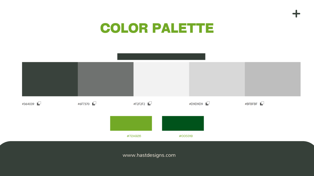
Color Palette:

      • Black – Power, sophistication, and authority. Black evokes strength and professionalism—ideal for a security-focused brand.

      • Gold – Prestige, excellence, and trust. Gold adds a sense of premium quality and reliability, reflecting the brand’s commitment to elite standards in protection.

Deliverables

  • Logo suite (primary, secondary, and icon versions).
  • Brand style guide outlining usage rules and specifications.
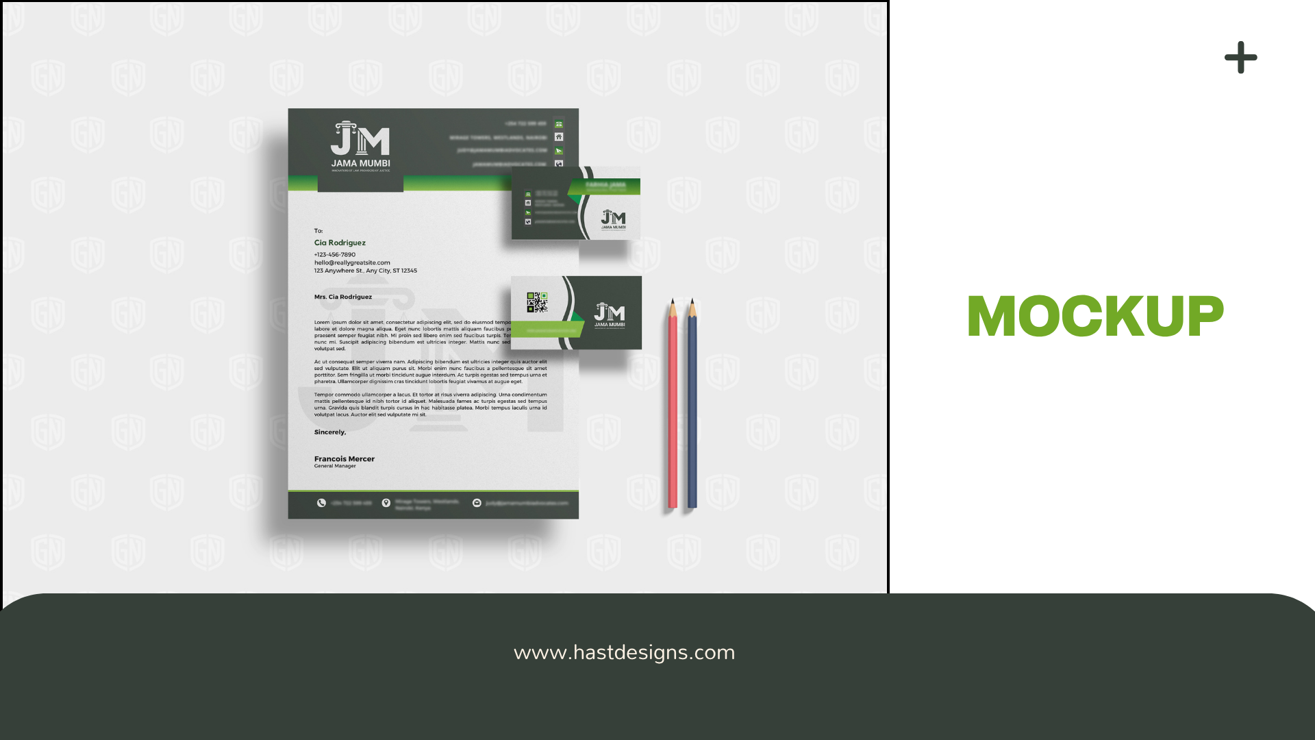
  • Stationery designs, including business cards and letterheads.
  • Uniform and vehicle branding concepts.
  • Digital assets for web and social media platforms.
  •  

Outcome

The rebranding of KSS International resulted in a cohesive and professional identity that resonates with their target audience. The new brand system effectively communicates the company’s commitment to security and excellence, positioning them as a leader in their industry.
0 %
Increase Integration
0 %
Business Growth
0
Number of Sales

What Client Say

Alpha Home Health Care – Logo Design & Visual Identity

Overview

Alpha Home Health Care is a wellness-focused home care provider committed to offering compassionate, personalized medical and support services in the comfort of patients’ homes. Their mission centers on care, trust, and dignity—core values that had to be visually communicated through the brand.

Objective

  • Create a Professional & Caring Identity: Develop a logo that balances medical reliability with emotional warmth.
  • Symbolize Home-Based Health Services: Visually represent the comfort and trust of care given at home.
  • Design for Scalability: Ensure the identity works seamlessly across uniforms, print materials, signage, and digital platforms.
  •  

Design Strategy

The logo concept merges the letter “A” with a house symbol, subtly integrating a cross to represent healthcare. The result is a clean, versatile, and meaningful mark that resonates with both professional and emotional undertones.

  • Typography: Soft yet structured sans-serif font for readability and a modern, friendly feel.

  • Color Palette:

    • Sky Blue – Trust, calmness, and medical professionalism

    • White – Cleanliness and simplicity

    • Soft Green – Healing, renewal, and compassionate care — a gentle nod to nature and recovery.

Deliverables

  • Logo (Full color, monochrome, icon versions)

  • Brand Color System

  • Typography Guidelines

  • Logo Usage Guide

  • Application Mockups (business cards, uniforms, mobile app preview)

  •  

Outcome

The final identity reflects Alpha Home Health Care’s values—reliability, care, and comfort—while offering a polished and scalable brand presence. The logo is instantly recognizable and adaptable across digital and print assets, setting a strong foundation for the company’s brand growth.
0 %
Increase Integration
0 %
Business Growth
0
Number of Sales

What Client Say

JM Law Firm – Logo & Brand Identity Design

Overview

JM is a law firm dedicated to delivering ethical, strategic, and client-centric legal services. Their values—integrity, professionalism, and clarity—needed to be reflected in a visual identity that communicates trust and authority while remaining modern and refined.

Objective

  • Create a Distinctive Brand Mark: Design a logo that blends classic legal symbolism with a modern aesthetic.

  • Establish a Cohesive Brand Identity: Develop consistent visual elements for both print and digital use.

  • Convey Professionalism & Trust: Ensure the brand evokes confidence, legal precision, and ethical leadership.

Design Strategy

The design approach focused on simplicity, strength, and symmetry. The initials “JM” were stylized into a sharp, balanced monogram—a modern emblem inspired by traditional law firm crests. The design language follows:

  • Typography: Elegant serif fonts to convey authority and legacy.

  • Color Palette: Deep navy and ivory tones to reflect professionalism, stability, and clarity.

  • Grid System: A geometric, proportional foundation ensured balance and precision across all visual assets.

Key Brand Elements

  • Primary Logo: A custom JM monogram anchored by symmetry and vertical weight, suitable for all brand touchpoints.

  • Secondary Marks: Scalable logomarks for social, stamps, and stationery.

  • Typography System: Serif and sans-serif combinations for a modern-classic brand voice.

  • Color Palette:

    • Navy Blue – Stability and Intelligence

    • Ivory White – Clean, Timeless Clarity

    • Gold Accent – Subtle Prestige

Deliverables

  • Logo Suite (Primary, Secondary, Icon)

  • Brand Style Guide

  • Stationery Design (Business Card, Letterhead, Envelope)

  • Social Media Branding Templates

  • Mockups for Digital and Print Use

Outcome

The final brand identity positioned JM as a forward-thinking, credible, and refined legal partner. The new visual system offered flexibility across platforms, reinforcing a consistent and premium image in both local and international legal markets.
0 %
Increase Integration
0 %
Business Growth
0
Number of Sales

What Client Say

SalePush Group Website Project

Overview

SalePush Group is a dynamic enterprise operating in both Kenya and Somalia, offering a comprehensive suite of services in security, logistics, and real estate. With offices in Nairobi and Mogadishu, the company is committed to delivering tailored solutions that address the unique challenges of each region

Objective

  • Service Showcase: Clearly present the diverse range of services offered, including security solutions, logistics, and real estate.

  • Regional Representation: Highlight the company’s operations and presence in both Kenya and Somalia.

  • Lead Generation: Incorporate features to facilitate inquiries and client engagement.

  • Brand Establishment: Enhance SalePush Group’s online presence and credibility.

Development Process

  • Discovery & Research: Conducted thorough research to understand the company’s services, target audience, and regional nuances.

  • Information Architecture: Structured the website to ensure intuitive navigation and easy access to information.

  • Design & Development: Created a responsive and user-friendly design that reflects the company’s professionalism and regional presence.

  • Content Integration: Developed clear and concise content to effectively communicate the company’s offerings and values.

  • Testing & Launch: Performed comprehensive testing to ensure functionality across devices and browsers before launching the website.

Key Features

  • Responsive Design: Optimized for seamless viewing across desktops, tablets, and mobile devices.

  • Service Pages: Dedicated sections detailing the company’s security, logistics, and real estate services.

  • Regional Navigation: Clear pathways for users to explore services specific to Kenya and Somalia.

  • Contact Forms: Integrated forms to facilitate inquiries and client engagement.

  • Multilingual Support: Prepared for future integration of multiple languages to cater to diverse audiences

Outcome

The newly developed website successfully positions SalePush Group as a reliable and professional service provider in East Africa. It effectively communicates the company’s diverse offerings and regional presence, enhancing brand credibility and facilitating client engagement.
0 %
Increase Integration
0 %
Business Growth
0
Number of Sales

What Client Say

Amal Cargo Website Project

Overview

Amal Cargo is a global freight forwarding company with a strong presence in Jordan and Qatar. Specializing in air cargo logistics, they provide fast, reliable, and cost-effective shipping solutions for businesses and individuals. Their mission is to streamline international cargo movement by offering tailored logistics services designed around each client’s unique requirements.

Objective

The primary goal was to design a clean, responsive, and informative website that effectively communicates Amal Cargo’s logistics capabilities and global reach. Specific objectives included:

  • Service Presentation: Clearly outline the range of freight forwarding and cargo solutions offered.
  • Client-Centric Messaging: Emphasize tailored logistics services designed to meet varied shipping needs.
  • Lead Generation: Integrate inquiry forms and contact features to support client engagement and conversions.
  • Brand Credibility: Strengthen Amal Cargo’s digital presence and establish trust with international clients.

Development Process

1. Discovery & Research
We began by understanding Amal Cargo’s business model, target audience, and key service differentiators. This phase included competitor benchmarking and identifying industry best practices to guide the site’s structure and user experience.

2. Information Architecture
Based on insights gathered, we mapped out the site structure to ensure intuitive navigation. Key pages such as Home, About, Services, Track Shipment, and Contact were prioritized for clarity and ease of access.

3. Wireframing & UX Design
Low-fidelity wireframes were created to define layout and content hierarchy. Special attention was given to user flow, ensuring a seamless experience across devices.

4. Visual Design
We developed a clean, professional design system reflecting Amal Cargo’s brand identity. The color palette, typography, and iconography were chosen to convey reliability, global connectivity, and efficiency.

5. Development
The site was built using modern web standards—HTML5, CSS3, and responsive frameworks—to ensure fast loading, cross-device compatibility, and ease of maintenance. A CMS was integrated to allow easy content updates by the Amal Cargo team.

6. Optimization & Testing
We conducted comprehensive QA testing across browsers and devices. SEO basics were implemented to enhance discoverability, and performance optimization techniques were applied to ensure fast page loads.

7. Launch & Handover
Upon approval, the site was launched on a secure hosting environment. A handover session was conducted to guide the client through content updates, tracking tools, and performance monitoring.

Key Features

1. Clean, Responsive Design
Optimized for desktops, tablets, and mobile devices to ensure a seamless experience across platforms.

2. Service Highlight Sections
Dedicated service pages with clear breakdowns of air freight offerings, transit times, and logistics benefits.

3. Multi-Location Contact Integration
Separate contact details and inquiry forms for Jordan and Qatar offices, enabling region-specific communication.

4. Shipment Tracking Interface (Placeholder or Integration-Ready)
A streamlined section for shipment tracking integration, positioned for future API connection or manual input.

5. Quick Inquiry Form
Embedded forms across key pages to capture leads, enabling users to request quotes or more information easily.

6. Clear Call-to-Action (CTA) Strategy
Consistent CTAs such as “Request a Quote,” “Contact Us,” and “Track Shipment” guide user engagement and drive conversions.

7. SEO-Optimized Content Structure
Keyword-focused copywriting and metadata implementation to support discoverability in search engines.

8. Google Maps Integration
Interactive location maps for both regional offices to improve accessibility and enhance trust.

9. Fast-Loading & Lightweight Framework
Built with performance in mind—minimized scripts and optimized assets for quicker load times.

10. Scalable CMS
A user-friendly content management system allows the Amal Cargo team to update services, blog entries, and FAQs without technical support.


Outcome

The new Amal Cargo website strengthened the company’s digital presence with a clean, responsive design and clear service messaging. It enhanced user experience, increased client inquiries, and positioned the brand as a reliable global logistics provider. Built for scalability, the site is ready to support future features like real-time tracking and client portals.
0 %
Increase Integration
0 %
Business Growth
0
Number of Sales

What Client Say

Case Study: Social Media Concept Design for Souk Exhibit

Overview

Souk Exhibit is a cultural event aimed at showcasing local artisans, crafts, and traditional products in a vibrant marketplace setting. The event organizers sought to enhance their online presence and attract a broader audience through engaging social media content.

Objective

  • Brand Awareness: Develop a cohesive visual identity for the event’s social media platforms to increase recognition and interest.
  • Audience Engagement: Create compelling content that resonates with the target audience, encouraging interaction and attendance.
  • Informational Content: Provide clear and appealing visuals that convey event details, schedules, and highlights.

Design Process

  1. Research and Inspiration
    • Cultural Elements: Explored traditional patterns, colors, and motifs associated with local crafts and marketplaces to incorporate authentic cultural aesthetics.
    • Audience Analysis: Identified the preferences and behaviors of the target audience to tailor content that appeals to their interests.
  • Visual Identity Development

    • Color Palette: Selected warm and inviting colors reminiscent of traditional markets, such as earthy tones and vibrant accents.
    • Typography: Chose fonts that are both modern and reflective of cultural heritage, ensuring readability across various devices.
    • Graphics and Imagery: Designed custom illustrations and icons representing artisans, crafts, and market scenes to create a cohesive theme.
  • Content Creation

    • Event Announcements: Crafted visually appealing posts to announce event dates, locations, and featured vendors.
    • Vendor Spotlights: Developed profiles highlighting individual artisans and their crafts to build anticipation and personal connection.
    • Engagement Posts: Designed interactive content, such as polls and quizzes related to traditional crafts, to foster community interaction.
  • Implementation and Strategy

    • Platform Optimization: Tailored content formats to suit various social media platforms, ensuring optimal display and engagement.
    • Posting Schedule: Established a consistent posting timeline leading up to the event to maintain audience interest and momentum.
    • Hashtag Strategy: Developed event-specific hashtags to increase visibility and encourage user-generated content.

Solution

The social media concept design successfully elevated Souk Exhibit’s online presence, resulting in increased engagement and attendance. The cohesive visual identity and strategic content plan resonated with the target audience, fostering a sense of community and anticipation for the event.

0 %
Increase Integration
0 %
Business Growth
0
Number of Sales

What Client Say

Brand Identity & Logo Design for GN Group

Overview

GN Group, a security services company based in Nairobi, Kenya, required a strong and professional brand identity to reflect its expertise in security, reliability, and trust. The goal was to create a visual identity that would enhance brand recognition and establish credibility in the market.

Objective

  • Logo Design: Develop a memorable and impactful logo that represents security and professionalism.
  • Brand Identity: Create a cohesive visual system, including color palettes, typography, and design elements, to maintain consistency across all marketing and operational materials.

Process

1. Research & Discovery

  • Conducted market research on security branding trends.
  • Analyzed competitors to identify differentiation opportunities.
  • Explored symbols and color schemes that convey protection, trust, and strength.

2. Concept Development

  • Designed multiple logo concepts incorporating security-related imagery such as shields, locks, and abstract protective elements.
  • Used a bold yet modern typography style to enhance readability and authority.
  • Selected a color palette emphasizing navy blue and metallic tones, representing strength and reliability.

3. Refinement & Finalization

    • Gathered client feedback and refined the chosen concept to align with GN Group’s vision.
    • Finalized brand guidelines covering logo variations, typography, and color usage for digital and print media.

Solution

The new brand identity successfully positioned GN Group as a trusted security solutions provider. The professional and visually appealing design reinforced the company’s expertise, helping to attract more clients and strengthen brand recognition. The logo and branding elements are now consistently used across uniforms, vehicles, marketing materials, and digital platforms, ensuring a unified corporate identity.
0 %
Increase Integration
0 %
Business Growth
0
Number of Sales

What Client Say

GN Group Website Project

Overview

GN Group, officially known as Guardian Nexus Group, is a Nairobi-based security services provider. They offer a comprehensive range of security solutions, including manned guarding, mobile patrols, CCTV installation, access control, and event security. Their mission is to deliver complete service solutions by closely consulting with clients to design services that meet their specific needs.

Objective

The primary goal was to create a user-friendly, informative, and responsive website that effectively showcases GN Group’s services and expertise. Specific objectives included:

  • Service Showcase: Clearly present the diverse security services offered.
  • Sector-Specific Solutions: Highlight tailored security solutions for various industries.
  • Lead Generation: Incorporate features to facilitate inquiries and client engagement.
  • Brand Establishment: Enhance GN Group’s online presence and credibility.

Development Process

Discovery and Planning

  • Client Consultation: Engaged with GN Group to understand their services, target audience, and brand identity.
  • Content Strategy: Collaborated to develop content that accurately reflects their offerings and values.

Design and User Experience

  • Responsive Design: Ensured the website is accessible and visually appealing across all devices.
  • Navigation Structure: Developed a clear and intuitive menu, allowing users to easily explore services, sectors, and contact information.

Development and Integration

  • Service Pages: Created detailed pages for each service, providing in-depth information and benefits.
  • Sector Pages: Developed sections highlighting GN Group’s expertise across various industries, such as residential, commercial, industrial, retail, and healthcare.
  • Contact Forms: Integrated forms for service inquiries, job applications, and general questions to streamline communication.

Testing and Launch

  • Quality Assurance: Conducted thorough testing to ensure functionality, responsiveness, and compatibility.
  • Client Review: Incorporated feedback from GN Group to refine the final product.
  • Deployment: Launched the website and monitored performance to ensure a smooth user experience.

Key Features

  • Comprehensive Service Listings: Detailed descriptions of security services with easy navigation.
  • Sector-Specific Solutions: Dedicated pages outlining tailored services for different industries.
  • User Engagement Tools: Contact forms and call-to-action buttons to encourage inquiries and client interaction.
  • Responsive Design: Optimized for desktops, tablets, and mobile devices to reach a wider audience.

Outcome

The GN Group website effectively communicates the company’s expertise and range of services. It serves as a robust platform for client engagement, providing clear pathways for potential clients to learn about services and initiate contact. The responsive design ensures accessibility, enhancing user experience across all devices.

This project underscores the importance of aligning web development with a client’s specific needs and industry standards, resulting in a digital presence that accurately reflects the brand and facilitates business growth.

0 %
Increase Integration
0 %
Business Growth
0
Number of Sales

What Client Say

MASO & SMASO Logo Project

MASO Logo and Branding by hastdesigns

Overview

In 2019, we were approached by MAKE A SMILE ORGANIZATION, a charity organization
based in Nairobi KENYA. They wanted Two logos that was unique in style and memorable.
One for them and another for their sister organization, SMASO. The design was to be sim-
plistic. After various logo design concept, we eventually settled for a design solution we
were all pleased with.

Objective

  • Developing new logo concepts that reflect the company’s services and industry.
  • Iterating on the chosen concept, refining typography, color palette, patterns and graphic elements.
  • Finalizing the logo design, ensuring it works well across different platforms and sizes.

Solution

By following a systematic approach and collaborating with them, we were able to create a logo that effectively represents the company’s brand and resonates with its target audience.

What Client Says

Atikafar Africa

Overview

Atikafar Africa is a Management consultancy Firm in Africa with dedicated Legal Professionals with a wide range of expertise, Legislative Drafting , Policies , Commercial and Tax , Data Protection,Alternative Dispute Resolution and more.

They approached us to design and create company logo aligning with their vision. This is what they settled for after various rounds of design takes. It was a pleasure to work with.

Objective

  • Developing new logo concepts that reflect the company’s services and industry.
  • Iterating on the chosen concept, refining typography, color palette, patterns and graphic elements.
  • Finalizing the logo design, ensuring it works well across different platforms and sizes.

Solution

By following a systematic approach and collaborating with the Atikafar Africa, we were able to create a logo that effectively represents the company’s brand and resonates with its target audience.
0 %
Increase Integration
0 %
Business Growth
0
Number of Sales

What Client Say