Overview
JM is a law firm dedicated to delivering ethical, strategic, and client-centric legal services. Their values—integrity, professionalism, and clarity—needed to be reflected in a visual identity that communicates trust and authority while remaining modern and refined.
Objective
Create a Distinctive Brand Mark: Design a logo that blends classic legal symbolism with a modern aesthetic.
Establish a Cohesive Brand Identity: Develop consistent visual elements for both print and digital use.
Convey Professionalism & Trust: Ensure the brand evokes confidence, legal precision, and ethical leadership.
Design Strategy
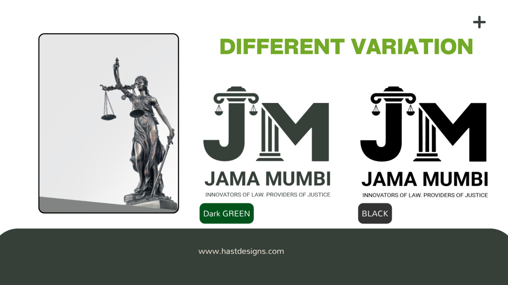
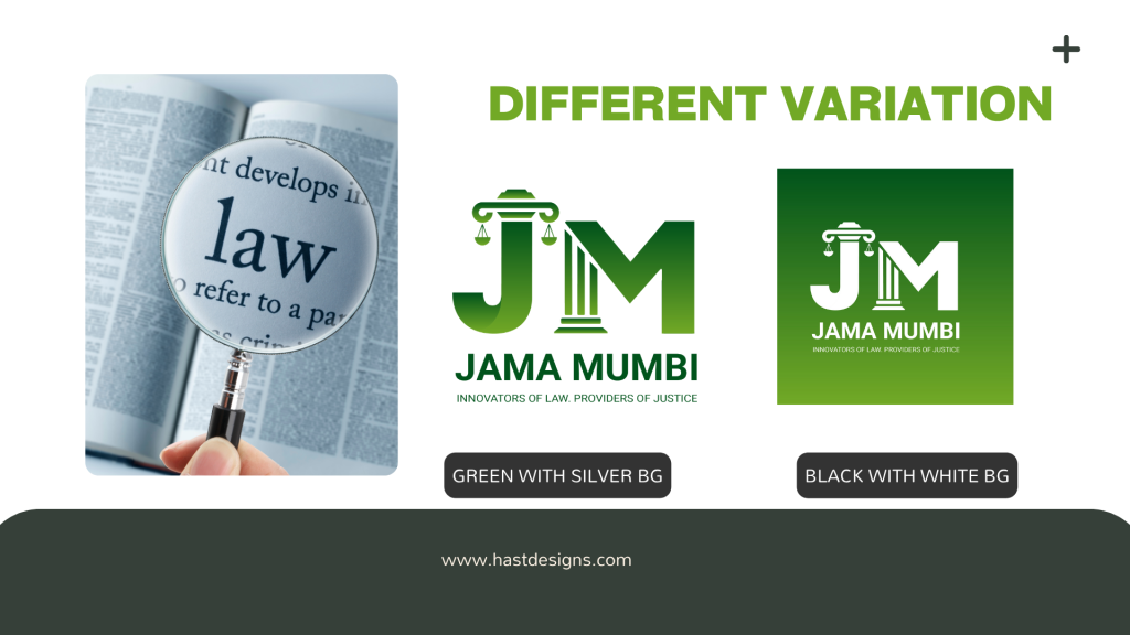
The design approach focused on simplicity, strength, and symmetry. The initials “JM” were stylized into a sharp, balanced monogram—a modern emblem inspired by traditional law firm crests. The design language follows:
Typography: Elegant serif fonts to convey authority and legacy.
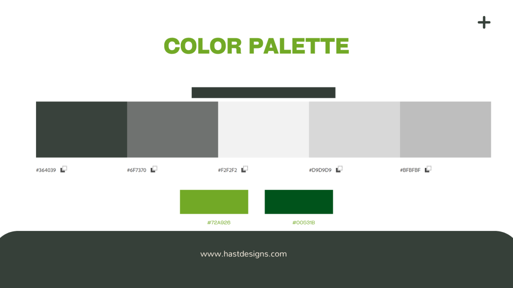
Color Palette: Deep navy and ivory tones to reflect professionalism, stability, and clarity.
Grid System: A geometric, proportional foundation ensured balance and precision across all visual assets.
Key Brand Elements
Primary Logo: A custom JM monogram anchored by symmetry and vertical weight, suitable for all brand touchpoints.
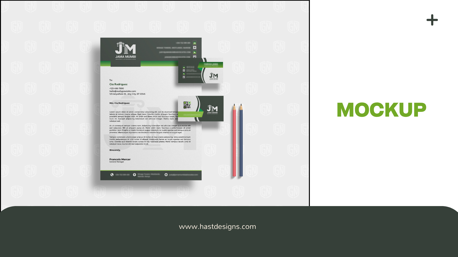
Secondary Marks: Scalable logomarks for social, stamps, and stationery.
Typography System: Serif and sans-serif combinations for a modern-classic brand voice.
Color Palette:
Navy Blue – Stability and Intelligence
Ivory White – Clean, Timeless Clarity
Gold Accent – Subtle Prestige
Deliverables
Logo Suite (Primary, Secondary, Icon)
Brand Style Guide
Stationery Design (Business Card, Letterhead, Envelope)
Social Media Branding Templates
Mockups for Digital and Print Use