Overview
KSS International is a Kenya-based firm specializing in security and protection services. Their mission is to provide reliable, professional, and discreet solutions tailored to diverse client needs. The company sought a brand identity that would reflect its core values of trust, strength, and vigilance.

Objective
Develop a Distinctive Logo: Create a logo that embodies authority, security, and professionalism.
Establish a Cohesive Brand Identity: Design a visual system adaptable across various mediums, including uniforms, vehicles, and digital platforms.
Enhance Brand Recognition: Ensure the brand stands out in a competitive market through a unique and memorable identity.

Design Strategy
The design process focused on merging traditional security symbolism with modern aesthetics. Key considerations included:
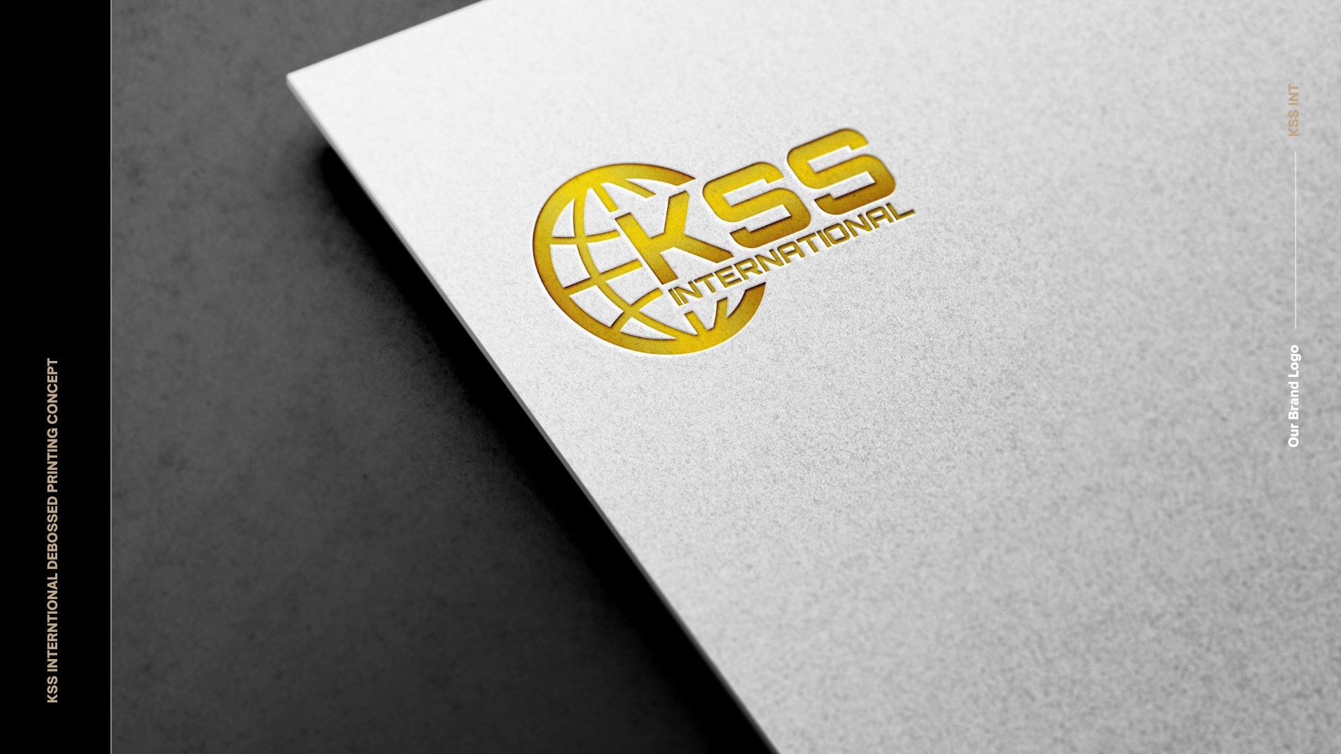
Primary Logo: A stylized shield integrating the initials “KSS,” representing security and unity.
Secondary Marks: Simplified icons for use on smaller applications, maintaining brand consistency.
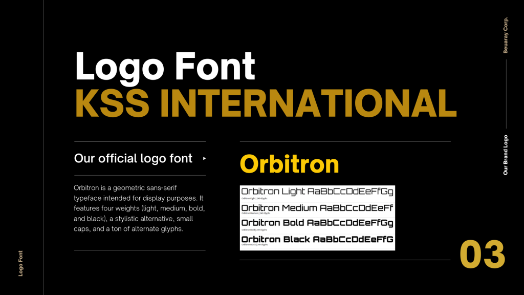
Typography System: A hierarchy of fonts ensuring readability and brand coherence across materials.
Color Palette:
Black – Power, sophistication, and authority. Black evokes strength and professionalism—ideal for a security-focused brand.
Gold – Prestige, excellence, and trust. Gold adds a sense of premium quality and reliability, reflecting the brand’s commitment to elite standards in protection.
Deliverables
- Logo suite (primary, secondary, and icon versions).
- Brand style guide outlining usage rules and specifications.
- Stationery designs, including business cards and letterheads.
- Uniform and vehicle branding concepts.
- Digital assets for web and social media platforms.

